happy accidents
Friday, 6 November 2015
Creative work often comes with accidents. And no, I don't mean leaving it too late to go to the loo because you're so engrossed. I also don't mean that time you spilled a full cup of freshly-brewed coffee all over your WIP--I felt your heart break from here.
I mean 'happy accidents' that strike you by surprise but don't involve a crashed laptop or irrecoverably deleting something (these things always end in guttural howling--have you backed up recently???).
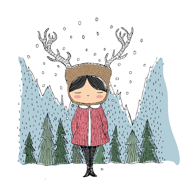
This week, I drew a quick image for the 52-Week Illustration Challenge for Week 44: SCANDINAVIAN (couldn't resist--am Scandi-obssessed). You can see the image, above, rendered in watercolour and fineliner.
Before I coloured the image, I scanned the line drawing so I could play around with it in Adobe Illustrator.
I converted the line drawing with LIVE TRACE so that I could create a Vector image (below). This means you can manipulate the lines just by clicking and dragging the little anchors. It also means you can delete the white background and make it transparent. This allows you to 'layer' digital colour behind the lines.
You can see in the image below, all parts of the image have had their white background removed so I can layer colour blocks underneath. Except the hat. I've left the white 'background' of the hat in place and I've layered a brown shape over the top of it. I then made the colour block slightly transparent so the lines can be seen underneath. It gives a softer, textured look.
Now, here is where the happy accident comes in.
When you work with Vector files, many of the smaller parts are grouped together, so when you click on them, you might have to separate them from other parts if you want to change their colour. While in the process of doing this, I accidentally made the entire image background pink, with white lines instead of black.
And I loved it! It looked just like those super cool illos you find in retro picture books, and I almost popped with excitement. So that's how they did it!!! (Well, no, they wouldn't have done it this way--they would have hand-painted or more likely block-printed the entire thing. New respect for those patient, patient illustrators.)
The image below is not the initial image but it's close. I simply touched up a few sections with black outlines to bring some contrast, outlined the antlers, et voila! Doesn't it look super cool?
I also played around with some more background colour (below). It's so much fun to be able to instantly change things up with digital illustration, and revert at the click of a button if you don't like. I also love the subtle changes in colour you can achieve--and how quickly and easily you can do that.
In fact, I feel immensely grateful that modern day illustrators can have these incredible, lightning-fast options to create with. Some may say the whimsy and charm of 'the good old ways' has been lost but I disagree. Art is art and still comes from the heart--it doesn't matter how it's rendered. I've seen artworks done on iPads that you'd be hard pressed to tell apart from a real watercolour painting.
If you love to draw and paint, do consider exploring digital platforms. After this happy accident, a whole new style awaits. Once I've finished working on my very first self-illustrated book (part hand-rendered, part printing, part digital), I'll be throwing myself into a whole new digital journey. Ideas already popping!
Subscribe to:
Post Comments (Atom)


1 comment:
Isn't it cool that we can discover, just by pure chance, wonderfully creative moments? Love following your journey.
PS that pink looks fabulous!
Post a Comment