Who doesn't love a good Before and After!??
Australia Illustrated contains over 1000 individual images of kids, animals, plants, objects, monuments, buildings, natural land features and more (it has 96 pages in order to fit them all in!).
Needless to say, the book took a very long time--around a year in total, and the entire thing was done at a time when I was still re-learning how to draw and paint (after a loooooong hiatus).
I was simultaneously teaching myself digital illustration and finishing art, and I found that by creating watercolour imagery in a relatively 'flat' way, I could then touch things up digitally. This really sped up a long and daunting process (and was also a lot of fun).
Above is a balloon I did for my Australian Capital Territory chapter--a flat, inked balloon coloured with watercolours. After scanning and placing in Photoshop, I was able to smooth the colour and then add digital highlights to give a more 3D look.
Below is an example of how I created some Monster Shakes for another page in my Australian Capital Territory chapter.
First, I sketched the shakes in pencil on watercolour paper ...
... then outlined them in fineliner ...
Next, I filled them (roughly) with watercolour ...
I then scanned this image and pasted it into Photoshop, where I tinkered with smoothness, tidied things up and added highlights ...
These were then cut out (digitally) and added to the Monster Shakes page, complete with sparkles! A section of the page, below.
Despite being 96 pages, this book didn't go through too many changes. Mostly, the changes were on more structural elements like the covers, chapter headers and endpapers.
'Chapter' headers were done for each state and territory, and originally I had used a dark blue-green for the background. This was later changed to a mono-printed orange (think: Outback), and it looks so much better. Look up gelli-print online to see what kind of mono-printing system I used for many of the page backgrounds in this book, including this orange one.
The following silhouetted page took around 40 hours to create. Subsequent chapters were a lot faster, as:
a) I became more skilled at creating and placing things
b) I could re-use a lot of the existing elements on new pages
I also played with adding characters to each chapter header, but I think it ended up looking too busy, so they were removed. I really love how the final came out...
I initially had a bit of a 'fact file' opposite each chapter header page (below). I scrapped these in the end, as they were defeating the purpose of the book, which is more about visual interpretation than information per se.
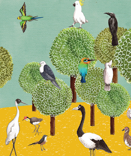
The other thing that went through several incarnations were the endpapers. Below are some drafts for one of my first ideas--the front endpapers having a line-up of trees and the rear endpapers being covered in birds, taken from throughout the book (I like birds).
I had three other ideas, too, but ended up scrapping them all and going for papercut-style endpapers because they tied in so well with the rest of the book, stylistically. I'm really happy I made this decision.
 |
| one of the rear endpapers |
Many of the actual pages also went through several incarnations... some would work almost instantly, and others I had to tinker with and tinker with and tinker with, to get 'just right'. Here are just two of around 10 attempts at this Wildflowers page for Western Australia:
...and the final...
Here are two of about a dozen different Gelati pages for Queensland:
...and the final...
...and this The Great Australian Swimmer page went through something like twenty incarnations; here are just some...
...and the final...
Some pages also needed some colour-changes (as per the blue sign in The Swimmer, above) because of the image they were coupled with to make a double page spread.
Lastly, here is a peek at the Quokka Selfie page (for Western Australia). First the sketch and inking on watercolour paper. Then with watercolour added. Again, scanned in, finished in Photoshop and placed on the digital page in Adobe Illustrator, along with some digital art.
It's all quite the process!
And the final... All but the polaroid images and the real-life postcard, bottom left, is digitally done.
Click the poster below to go to my Virtual Launch
homepage and follow along all posts!
Follow along on Instagram, Twitter and Facebook with hashtag
#ausillo


7 comments:
Beautiful... I can't get over how much work you have done to produce such a gorgeous book...
Isn't it the Best feeling when it finally clicks? Thanks for posting this. It's great seeing process, seeing the struggle and seeing how you got to that final, delicious click.
Wow, loved seeing the development, its one incredibuble book!
Lovely entrance!! I wish you the best with your beautiful book ;)
Thanks Tania - it is always interesting to look at someone process - you must be so proud of your achievement xx
Love the specific examples. Thx for sharing the inside looks.
Wow! SO fascinating and wonderful! x
Post a Comment